Now down to some detailed information. You probably have a good idea of what a trend looks like, but with technical analysis we have to “define” what it is so there is no ambiguity. This is a good thing, as we want to have repeatable results without subjectivity (guessing). Along with looking at trends, in this section we will also look at some rudimentary line drawing on the chart, and talk about general price movements.
A trend is the general direction an asset class is heading in. Most securities have an underlying trend that can take shape over days, weeks, months oryears and depending on the traders/investors time horizon they will look to benefit from these price movements.
The basic trend takes the form of “higher highs” and “higher lows” in an uptrend, and “lower lows” and “lower highs” in a downtrend.

Trends are fundamental to technical analysis. The stock markets are born from the minds of men. As the volume of interest converts into price, it becomes a mathematical mind game. Learning how to read price action and volume therefore offers you a practical insight of the inner dynamics taking place in the markets.
Many trading plans are based on the concept of a trend, with the trader identifying a trend as quickly as possible then trading to take advantage of it. It’s the old idea of the “momentum” of a price – unless something changes to affect it, the price will just keep going in the same direction.
Another trading adage is that you always trade in the direction of the trend to increase your probabilities. I have to say, that this does not apply all the time, but it certainly is a good rule of thumb when starting out. So if the trend is upward, you would only take out a long position, betting on the price increasing, and if the price is trending downward you want a short position, selling the bet to profit from a loss in value in the underlying. The underlying can be anything, whether it is an index, a stock, a currency doesn’t really matter as long as it is exhibiting a trend.
“One nugget that I try to adhere to is if an instrument is making higher highs or lower lows only trade in that direction, if something was 200p and is now 175p and has made a lower low you’re taking a trade against the current trend, do not make a trade in that stock until it reverses direction. A lower high can be used as an entry where the lower low becomes one’s stop, but trading against the current trend is imo asking for trouble. Most of us who have traded for a long time have had disaster shares; a look back at the charts of those shares and you think why did I ever get involved, easy with hindsight I know; but you need to wait until the instrument has decided it’s made enough noise (moved within its current trading range)and is now ready for a move outside of that range, when this occurs you tend to get a lot less stressful a trade, taking a lot of the psychological issues out of the equation as it intends to move towards your target with a lot more purpose!.”
So we can have what are commonly called an “uptrend”, and a “downtrend”. For an uptrend, the price is going up, and for a downtrend it is going down. Simple so far. The problem is that prices don’t go straight up or straight down, as I mentioned previously, and we get little glitches in the movement of the price that can make us wonder if the trend is continuing or reversing, which makes a big difference to which way you want to bet!
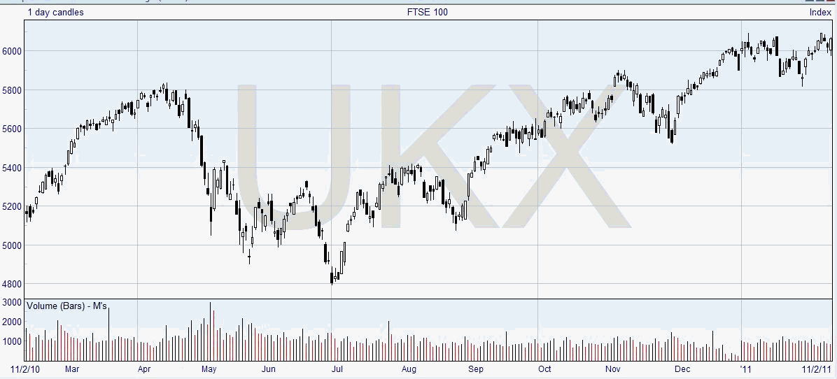
Another problem is that you will find prices don’t go up or down all the time, but can go sideways – depending what you’re tracking it may go sideways 40% of the time. Some people call sideways movement “trendless”, though really the price is exhibiting a trend of staying the same. You may recall that Dow defined this as no more than 4% fluctuation in the price, but you may see bigger variations in practice. So with all that said, let’s look at a typical chart of the FTSE 100.

Whoa! It really is confusing. I guess there is an up-trend from left to right, but there’s also a peak in April 2010, and a low in July 2010. So you see it all depends what time scale we’re looking at, you might want to say that the up-trend started in July 2010 but even that isn’t accurate by technical analysis standards.
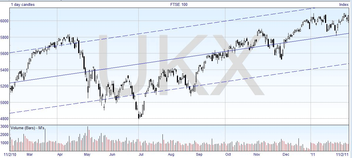
Those helpful people at ShareScope provide an automatic trend line facility; let’s see if that can help.

Bearing in mind that this is only working days, one hundred days is between four and five months – back to about October 2010. And yes, these lines are getting closer to showing what the prices are doing now.
The lesson in this exercise is to point out that you shouldn’t depend on automatic charting, as it can mislead you and give bad indications. Garbage in, garbage out, and in this case the garbage in is the time period we are looking at. From a common-sense point of view, there are several trends on this chart, and you can’t average across them and make any sense on a trading time-scale. How you look at the chart depends on the length of period that you are trading, and you have to find what works for your plan. For instance, you might break down November/December 2010 as a down-trend, December as an up-trend, and the right-hand column is mainly sideways. The first two trends, if you had identified them at the time, would have been tradeable.
Okay, I’ve teased you long enough. The technical analysis definition of an up-trend is that it has successively higher peaks and higher troughs; a down-trend has successively lower troughs and lower peaks. Even if the price is making new highs, if it retraces or drops down between the peaks to a lower level than it has hit before, then that does not count as an up-trend. In fact, if you think about it, it shows that there is a lot of uncertainty and no strong trend – with successively lower troughs it could also count as a down-trend, if you did not have the rule.
But of course it depends on the time scale you are looking at, the down-trend and up-trend noted above generally work with this rule on the daily chart, whereas if you were looking at an hourly chart there would certainly have been some exceptions to the rule, perhaps where it didn’t have successively higher peaks. If you chop the right-hand side up, the part that we called mainly sideways, on a shorter time-scale then you would be able to find up-trends and down-trends.
All this is really just a reflection of the Dow Theory and the different parts of the trend. Dow said that there would be a primary movement with secondary retracements, and further fluctuations with minor trends. Trends on a small scale build together to make larger trends, and so on as you increase the time-scale. We’ll look more at this in the next section, where Elliott Wave Theory professes that we can predict the fluctuations.
So it is important that you have clearly in mind what time-scale that you are betting on. When analysing charts it is important that the chart is constructed to reflect a time horizon for the trend being identified. For example, long-term trends would normally consider a time horizon that spans over at least a year with either weekly or daily price movements making up the composition of the chart. In contrast, an intraday trader may only look at charts that span over a week with the composition reflecting 30-minute price movements. A trend must thus be seen in context to the time period you are betting, which also relates to the underlying financial instrument. As the point of identifying a trend is to give you an indication of what to bet on, it is perfectly valid to identify a trend for short-term trading, even if the trend would fail for a day trader, or for an investor. Just keep in mind what you are trying to achieve.

And if you’re betting on a daily basis, then you don’t care that the five-minute chart would show prices going up and down, that’s not the trend you are interested in. But the day trader would be mainly interested in that chart, and less concerned about weekly charts, for instance.
You can contrast this again to the position of an investor, perhaps saving for retirement, who will mainly be interested in his capital growing year after year. He wouldn’t care that the price was down in one month or the next as long as he can look at his annual statement and see a steady growth in his money. For the investor, the stock would be in a long-term up-trend. Any trader would see this as long and short trading opportunities throughout the year.
Whichever way you consider it; long-term trends are made up of medium term trends, just as medium term trends are made up of short-term trends.
To help identify trends, technicians draw trend lines to help find where support or resistance may be. This is a simple line drawn in the direction of the price movement through the lows of the trend. Technicians use trend lines to anticipate where support may be found in a security so that an investment/trade can be made in the hope of a move back to the upside and consequently, a profit.
Note: A lot of spread betting amateurs who are looking at spread betting the markets make the mistake of thinking they can predict where the markets are heading. They seem to think that just because a market goes down enough it has to come up right away, and pick almost arbitrary moments to buy a falling market or sell a rising market. I know from my discussions with people in the industry that this is a critical mistake a lot of spread betters make. So next time you see a market moving up or down very rapidly you’re probably better off to go with the trend, if your nerves and your bank account can’t take it though, best to get off the roller coaster!
P.S. At the time of writing (July 2012) the Sentix European Investor Confidence is resting at the lowest point since July 2009. This is useful as a confirmation/trend indicator, and on the long run view, can be useful as a contrarian indicator. We generally want to see this improving in a medium term cycle if we’re bullish, even though it tends to only turn a month or so late.
And as a contrarian indicator, it can inform us when prices of European stocks are depressed – it’s just a matter of “how much more depressed can they get” and “how long will it take to realise value”. Being a European index, it reflects a lot more of the negative sentiment than if it was a US Investor Confidence index, which would be more important at this stage.