So you’ve opened your new account and now you’re sat, staring at a selection box of financial goodies; Dax 30, FTSE 100, Gold, Google…..What do I do first?
You need to find an edge; that reason to sell the FTSE or buy gold. You might have got a hot tip from Stan down at the Red Lion or perhaps you just fancy the name Xstrata.
Either way, you can’t just hit the trade button without a bit of background work. You need some help to decide whether the price is more likely to rise or fall-whether you should buy or sell. Today I’m going to run through the absolute basics of how to start using the charts, then in Part II tomorrow I’ll talk a bit about technical analysis and how I use charts for my trading.
Technical Analysis is the study of price and volume behavior on a stock chart. Chartists believe that all information known about a company reflects in its price chart and use it to make their trading decisions.
All forms of technical analysis derive their information from the daily open, high, low and closing price and corresponding volume. In its simple form, technical analysis is a study of trendlines, supply (resistance) and demand (support) levels and corresponding behavior of volume on a bar chart to gauge whether the buyers or sellers are in control of the stock. More advanced technical analysis presents the above information via countless different indicators and various types of charts.
News Flow
Trading as an individual is a world apart from the big City trading desks you see on the telly. In terms of news flow there are systems that will give you the economic releases at exactly the same time as the big boys. Generally, free services will be delayed by enough time to kiss goodbye to trading the news, but if your strategy is to trade longer time periods these might be fine.
But when it comes to company information, Henry from XYZ Investment Bank isn’t going to give you the inside track on the latest company he’s just been to visit. And how often has a huge move in a company’s share price been followed by news of a take-over, or a profit warning? Face the facts; we’re not going to compete on news flow.
Charts Tell The Story
How can we compete? No problem; you’ve heard the phrase; “a picture paints a thousand words”. Well, a good chart will tell you plenty in the time it takes to Google up the research on your chosen bet.
Daily Bar
A daily price bar shows the movement of a stock’s price on any given trading day. When coupled with volume, it can tell the trader whether buying pressure or selling pressure dominated the day.
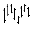
Trendline – rising
A rising trendline is a straight line of support. It is drawn to define an uptrend by connecting common price lows on a chart. It can help the trader stay with a rising stock or sell on a break to the downside.
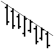
Trendline – falling
A falling trendline is a straight line of resistance. It is drawn to define a downtrend by connecting common price highs on a chart. It can help the trader stay with a short position in the stock or buy on a break to the upside.
Support
Support is defined as a price level where the market perceive a stock to be undervalued and demand is plentiful. Traders may purchase stock on a pullback to support or sell on a break to the downside.
Resistance
Resistance is defined as a price level where the market perceive a stock to be overvalued and supply is plentiful. Traders may sell stock at resistance or buy on a break to the upside.
Trend Channel – rising
In a rising trend channel, prices are bounded by two parallel lines of support and resistance. It is drawn by connecting common price highs and lows on a chart. It helps the trader stay with a trending stock that is rising in price or sell on a change of trend.
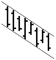
Trend channel – falling
In a falling trend channel, prices are bounded by two parallel lines of support and resistance. It is drawn by connecting common price highs and lows on a chart. It helps the trader stay with a short position that is falling in price or buy on a change of trend.
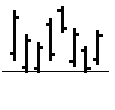
Trend channel – horizontal
A horizontal trend channel or sideways trading range shows a balance of supply and demand. Traders may purchase the upside breakout of resistance or sell short on a break of support.
Charts
Opening up a chart is as easy as clicking on the first icon to the right of the ‘Order’ button (the one in the red circle).
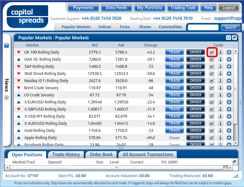
If you’re logged onto your account your chart will look something like this:
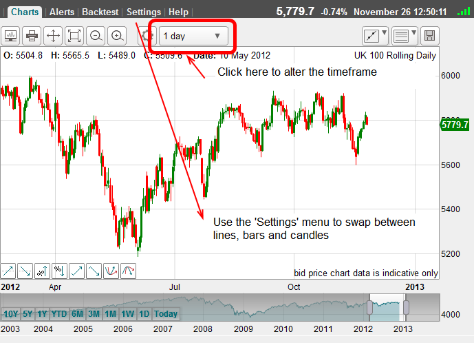
There are plenty of tools on these charts that I’ve never used; Libraries are bursting with different strategies for using technical analysis (think Hogwarts for grown ups) and the idea is that the tools are here if you need them.
But as this is the introductory tour I’ll set out the ‘need to knows’ and deal with the heavy stuff once you’ve settled in.
Lines, Bars And Candles
There are three main ways of representing the price on a chart, line, bar and candle.
If we use a car analogy the line graph would be Henry Ford’s prototype; the basic model, you get what you see. For some traders this is great, an easy to read line, showing you just where the price is. The trouble is that once you start adding a few moving average lines your chart looks like it’s been over-run by break-dancing spiders.
The bar chart is a sort of Ford Mondeo, a massive improvement on the original with a few more bells and whistles. Whereas the line chart only shows the closing price for the period (see next section on periods), the bar chart also shows the high and low prices for that period. The standard model shows the close as a little mark on the right-hand side of the bar; the Ghia model also includes the opening price on the left-hand side. The bar chart gives you a feel for how the price has been behaving during the period as well building a picture over the longer period. It’s a bit like watching the edited highlights of a game rather than just seeing the final score.
Just like in modern times, the Japanese came up with this top of the range model; candles, the Lexus of chart analysis. Candles go that step further than bars; the same information (open, close, high, low) is portrayed in a way that allows further analysis of their patterns. Trained users can pick up trends, and changes in trends, over any time period by analysing candle patterns. To me candles are the dog’s do-da’s and I strongly recommend having a read of our beginners’ intro to Candlestick Trading Signals.
Chart Patterns
A visual inspection of any stock chart will reveal that over time, prices do not always behave in a random or chaotic way but rather move about in stages, trends, congestion zones and sometimes repeating patterns. As buyers and sellers fight for control of the share price, the daily market forces of supply and demand shape the behavior of prices on a chart.
Certain patterns have a habit of re-appearing, time and again. The same patterns have been used by professionals to safely trade the market for over a hundred years. These patterns will continue to appear on charts because they are a manifestation of the basic underlying human psychology that’s always present in the market – the emotions of fear, hope and greed.
All successful trades begin with well timed entries. When’s the right time to buy? Only the market knows. Therefore, perhaps the best way to time your entries into the market is to use the market itself as your timing tool.
Chart patterns can signal a time to either buy or sell a stock. They provide the trader with a simple and straightforward way to enter the market, often with minimal risk. One advantage you have when trading patterns is that you can accurately measure both your risk and the expected profit target before entering the trade. Knowing these factors allows you to make informed planning that is a vital component of successful share trading.
Time Frames
Often referred to as ‘periods’, time frames have something for everyone from the full-time day trader to the guy with a full time job who takes a longer approach, basing his trades on the daily close.
The time frame is the period that each bar or candle represents. This ranges from as short as 1 minute to as long as daily or weekly (some charts, even include monthly bars).
Just like the candles above, and all the other wonders of technical analysis, the final choice is yours; it’s what you feel most comfortable with.


