There are five lines that make up the cloud chart construction, and they are called the Turning Line (or Conversion Line), the Standard or Base Line, Cloud Span A or 1, Cloud Span B or 2, and the Lagging Line (or Lagging Span). Here are the separate descriptions and charts showing each individually.
Turning Line

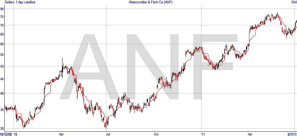
The Turning Line is similar to a moving average, usually with a time period of 9 days. It’s constructed slightly differently, as it is actually a plot of the midpoint between the highest high and the lowest low in the last nine days. So if you had to calculate it, you would just add together the highest price and the lowest price in the last nine days, and divide by two.
You will find that a moving average is usually smoother, as it’s constantly going up and down incrementally with each passing day. What happens with the turning line is that it can stay at one level for a few days, so it progresses in a series of steps. If the ninth day was not the highest or lowest price, and there is no new record the next day, then the level of the line will not change. It will still be based on the highest and lowest prices that were used the day before.
Standard Line

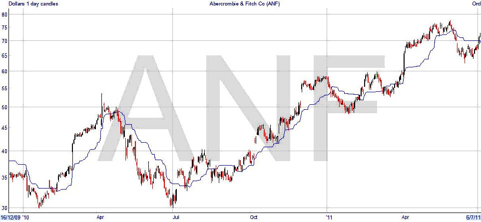
The Standard Line is very similar, and is calculated back 26 days instead of 9 days when finding the highest and lowest prices. Because of this, it can be even more jerky than the Turning Line, staying for days at one level. It’s said that the number of Japanese trading days in a month is the reason for picking 26 days.
As these two lines are similar to the moving averages, they can be used as a trading signal just like the two moving average method. When the 9 day crosses to above the 26 day, that is a bullish signal, and vice-versa. If you compare the results to the moving average method, you will find that the signal may come earlier or later, depending on the particular price pattern.
Cloud Span A

So far, it’s just been a variation on the trading analysis that you’ve already seen. But once you get to clouds, then you are looking at something distinctly different from what has gone before. The cloud is made up from two lines, and the first one, Cloud Span A, is formed from the Turning and Standard Lines just drawn. The line is the midpoint between the two lines, but it is shifted forward in time on the chart by 26 days, which is a unique feature in technical analysis.
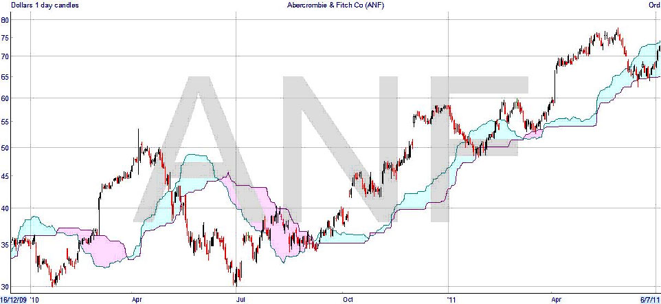
If you look at the chart above, where the Cloud Span A line is drawn in isolation, you can see the effect – the line is a sort of average of the price, but moved forward in time, so it reflects the actual price movements in the future.
Cloud Span B

Cloud Span B has a similar idea behind it, but has nothing to do with the calculated Turning and Standard Lines. In this case, it is drawn by taking the midpoint of the last 52 days, and projecting that forward by 26 days, just as with Span A. Taking the midpoint is just the same process as used for drawing both the Turning and Standard Lines, but over the extended period of 52 days, or time intervals. So the result, as you can see above, is again mimicking the price movement somewhat, at a future time, but even more averaged.
What you are doing with the cloud lines is taking something similar although not the same as an average – the midpoint – and projecting it forward in time on the chart. Span A is a shorter term “average” than Span B, and they come and go, crossing each other just as two moving averages will – except, again, they are shifted into the future, something that you will not see with any moving average methods.
The Clouds

Here you can see the clouds. They are simply the areas between the Cloud Span lines, with shading or hatching. The colour of the shading depends on which line is on top, and the colours used here are typical. Cloud Span A, the shorter term line, is blue, and Cloud Span B is red.
As with moving averages, when the short term is above the longer term line, it indicates a bullish rising market, which you can see in the blue clouds above; the red clouds show a down-trend. But again, these are shown 26 periods after the event, because of the time shift.
Lagging Line

Now we come to the last line, the Lagging Line. Just to confuse if you are not paying attention, this one is set back, not forward, 26 time periods – it’s lagging, okay? It’s just the price line re-drawn in the past, no averages or midpoints this time. You will notice that it is not complete on the right. That’s because we don’t know where the price line is going to be, and the Lagging Line can only be drawn after the price has happened. The Lagging Line is often taken as a “confirming” signal when reading the charts. It’s frequently looked at in relation to the Cloud Span B line, so you are seeing the 52 period midpoint interacting with the price 52 periods behind (as the cloud lines are shifted forward 26 and the Lagging Line shifted back 26).
By the way, it’s just drawn from the closing prices each day, nothing exotic there. So now you have the details of the way that an Ichimoku chart is drawn. In summary –
Turning Line – midpoint of the high and low of the last 9 sessions
Standard Line – midpoint of the high and low of the last 26 sessions
Cloud Span A – midpoint of the Turning Line and the Standard Line, shifted forward 26 sessions
Cloud Span B – midpoint of the high and low of the last 52 sessions, shifted forward 26 sessions
Lagging Line – the closing price shifted backward 26 sessions.