In this section I will illustrate some basic charting entry ideas. I do not put these forward as ‘good trading strategy’ – far from it, but they are just a few well known trading patterns for you to consider as part of a trading strategy.
Trend Following
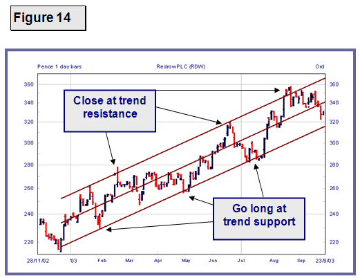
Figure 14 below shows Redrow PLC in an established trend. Once you can identify a trend you should only trade with the trend – in this case long. You can go long each time the price drops to trend support and close as trend resistance is reached.

Trend Break
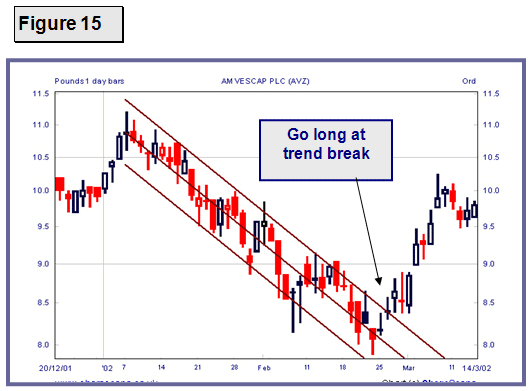
In Figure 15 below we see AMVESCAP in a downward trend, which is then broken – an opportunity to go long. Prior to this was a great opportunity to trade short on the downtrend.

Double Top / Double Bottom
Below you can see BHP Billiton makes a Double Top. Both times the price was rejected at 341. In between the two attempts to break 341 a low was made. The double top is completed when the price subsequently goes below this low. A short trade is then entered. If you were to invert this chart you would see a Double Bottom, which would trigger a long trade.

50% Consolidation
Sometimes difficult to spot but can be quite reliable particularly with FTSE 250 and Small Cap Companies. After a good move, in this case (Figure 17) a drop from the pink line of 25 points. The price then consolidates or hesitates before resuming in the same direction. In the example below the price dropped another 25 points exactly from the middle of the consolidation (blue line).
You can enter short as the price passes the previous low (green line) and set a target to close for profit based on the number of points from the top (pink line) to the consolidation centre.
Another point to look for when looking at this type of trade is the distance from the top (pink line) to the bottom of the consolidation (green line). This is likely to be the same as the top of the consolidation (just above the blue line) to the target price (purple line).

Triangle Break
The chart of Millenium and Copthorne Hotels in Figure 18 is an interesting one and shows how charts can tell a predictable price story. This is a good example of how to read chart patterns.
Support points connected by the long pink line and resistance points joined by the shorter pink line form a triangle, a classic consolidation pattern. The price eventually breaks out the triangle and usually continues the trend it was in prior to entering the triangle.
A measurement vertically at the base of the triangle gives the target for the price increase following the break.
If you look closely you will also notice several further examples of the 50% consolidation shown in Figure 17, two in the base of the triangle and one in the break up from the triangle. In fact there are at least two others – see if you can spot them.
In addition, there is a double bottom at the lowest price on the chart.

Re-testing a Resistance Break
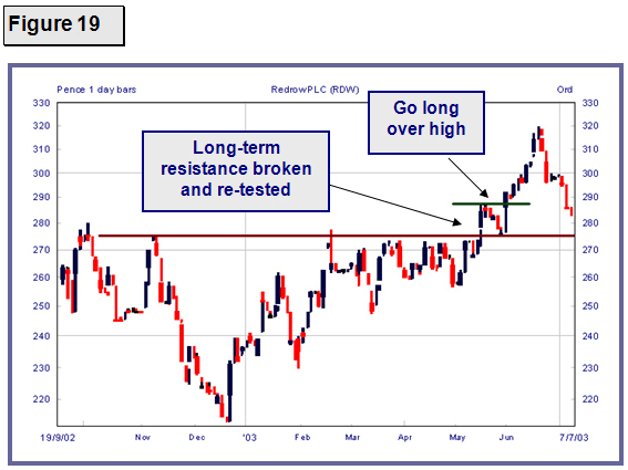
Figure 19 shows a long-term resistance level for Redrow PLC. Eventually the resistance breaks. The price then goes back to re-test the resistance level from above which now provides support. The price bounces and you go long over the previous high.
