Technical analysis fundamentals provides an introduction to the key ideas that make up technical analysis. Technical analysis is a large and interesting area of study, but we will only scratch the surface here.
We’ll be as practical as possible and keep the theory to a workable minimum.
What is Technical Analysis?
Technical analysis is a set of skills that a trader can use to try to determine the most likely next move a stock (or market index) might take. The analysis is based on a stock’s previous price movements.
The elements that come into play in technical analysis are:
- price trends
- changes in the stock’s volume
- price patterns
- the effects of the major stock market indices, and
- the effects of industry sector indices
How are Stock Charts Used?
Price is the most important item on a stock chart. We’ll see where the price has been in past. How the stock tends to move. Notice how it reacted in certain circumstances and make a judgment call about the likelihood of that same behavior being repeated again.
We don’t have to guess what might happen. Probability is the key. Some patterns just keep repeating again and again. Our job is to find these profitable price patterns.
Another useful concept in technical analysis is “confirmation”. We can use certain elements to confirm what’s happening in the stock chart. Volume is a very good confirmation tool. We like to see the movement in price and volume telling the same story. We’ll talk more about this in a later article where I’ll discuss breakouts from trading ranges.
Trends show you the Way
You may have heard the saying: “the trend is your friend”. This highlights the importance of following the dominant trends in stocks, overall markets, and industry sectors. A trend will keep you on the right side of the trade. The trend lets you know when to get in and when to get out.
Simple trend following strategies can be very profitable. And you might be surprised to hear that some of the best traders tend to keep things simple.
How do you find Trends?
The easiest way is to use what’s known as a “moving average” (MA for short).
Moving averages smooth out the gyrations of the price in a stock chart and makes it easy to see when the price is rising, falling and moving sideways.
There are a number of different types of moving average.
Simple moving averages are based on a stock’s average price over a particular period, giving an equal weighting throughout the period examined. As a result they are slower to react to recent price movements than other types.
Exponential moving averages are more reactive to recent price movements and this makes them a better choice for traders. Some traders also use a weighted MA that is balanced to their preferred trading style and holding period.
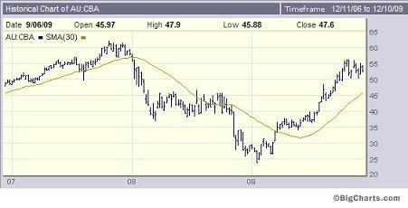
Simple moving averages are easiest to calculate. You set the period for the MA. Let’s say 50 days. We add up the closing prices for a particular stock for the last 50 days and divide the total by 50. This gives us one day to plot on our chart. So a stock chart would have a number of these calculations in a series, displayed on the screen with the stock price (see the example below).
 The stock chart above is a 3 year weekly chart with a 30-week moving average.
From looking at the chart above it becomes obvious that we want to hold the stock only when the price is above the MA. When the price is above the MA, the stock price is rising. When the price is below the MA, the stock price is going down.
If the MA is rising and then starts to flatten out (i.e. move in horizontal direction to the right), we might conclude that the uptrend could be about to change so it might be time to sell our stocks. On the other hand the MA might move sideways for a little while (weeks or months) and then continue upward.
One thing is for certain, when the MA moves sideways we need to be alert to a possible change of direction in the trend. If it goes down we’ll sell. If it rises, we’ll hold on for some more profits.
By simply following a moving average and making sure that we only own the stock when it’s above the MA, we can make money.
A trickier way to find a trend
You can also find trends by drawing trendlines on a stock chart. A trendline that represents an uptrend is drawn by finding three or more price bar lows that line up (see the example below).
In the example above, you can see where the price bars touch the trendline. In total there are 5 touches. This is good trendline. The more times the trendline touches a bar the better.
For a downtrend, the trendline needs to line up with the high points on the price bars.
Trendlines are great but you can’t always find them because three price bar lows (or highs in the case of a downtrend) might not always line up. The other thing is that trendlines need to exist for about a month or more if they are to be valid. You want to find trendlines that indicate a strong persistent uptrend.
So, trendlines are terrific if you can find them, if not, just use a moving average with a period that suits your trading time frame. If you’re an intermediate-term trader you might use a 50-day MA to catch moves lasting from six weeks to four months. If you’re a long-term trader you might use a 150-day MA to catch moves lasting from four to twelve months.
