Bollinger bands are a development of moving averages. Traders noticed that it was possible to draw a channel or band each side of a moving average, and the price would normally be within this. Any time the price went outside you could assume it was “overextended” and that it would come back again in time. Typical figures for a moving average envelope would be an SMA(20) with 10% added and subtracted to give the envelope lines.
“Bollinger Banks forecast the potential high and low prices for an instrument relative to the moving average. They also help traders visualise volatility and determine when a trend may continue or reverse.”

Bollinger Bands consist of three bands:
- THE MIDDLE BAND is calculated on the average price of an instrument over a specific time period.#
- THE UPPER BAND uses the Middle Band plus two standard deviations; a standard deviation measures how close prices are to the average.
- THE LOWER BAND also uses the Middle Band, minus two standard deviations.
During normal market conditions, the bands usually appear to move in a synchronous pattern, but you can use them to view market volatility.
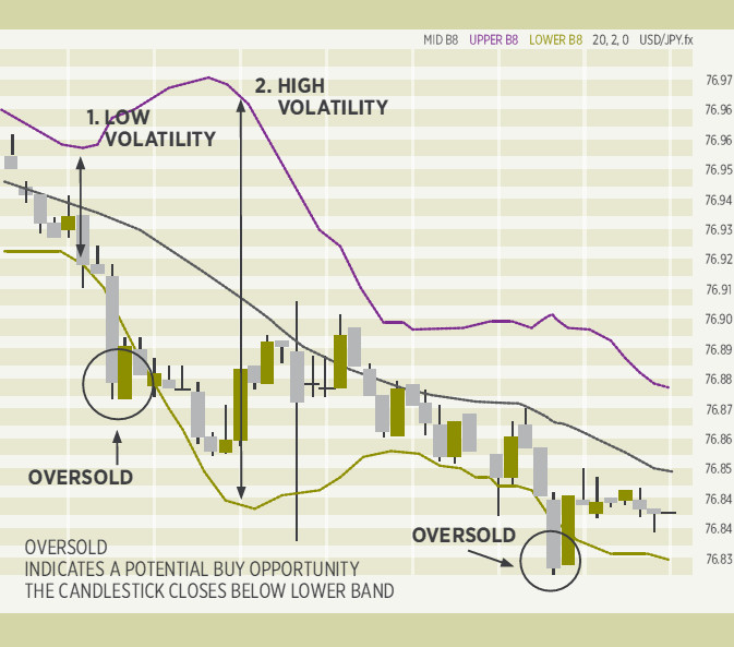
- If the distance between the bands is tight, it indicates low volatility in the market.
- If the distance between the bands is wide, it shows high volatility in the market.
When price movements closely follow the middle band, traders consider the instrument to be trading within its average.
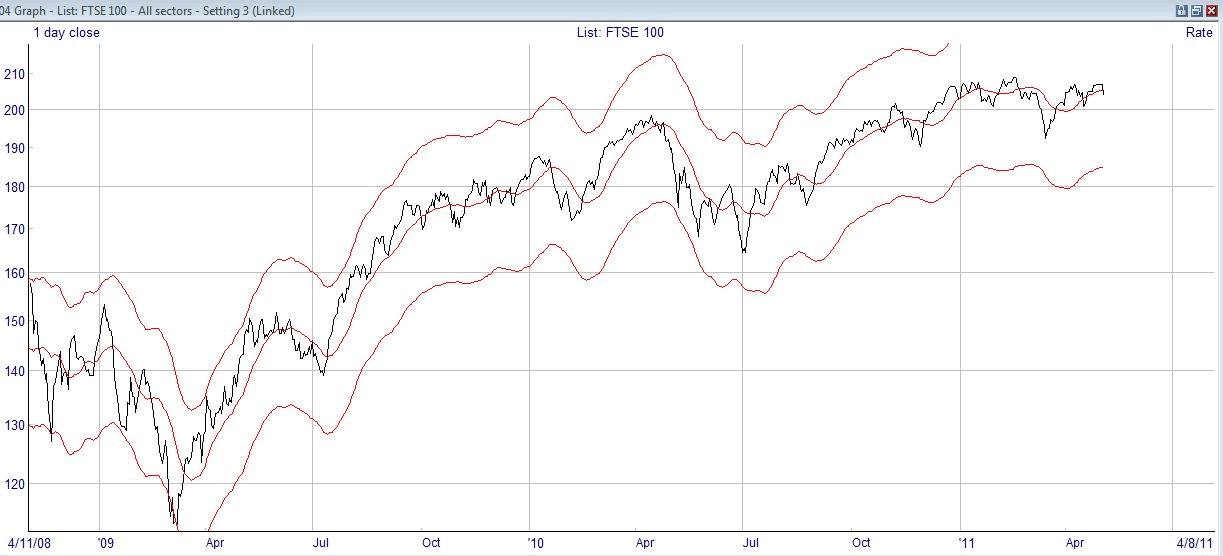
Here’s an example: –

The middle red line is the SMA(20), and the upper and lower lines are 10% above and below, giving a channel which follows the movement of the moving average. Most of the time, the price is within this channel, but you can see where it went outside (below) in the first quarter of 2009. The theory is that the price should “revert to mean”, and indeed it did, increasing rapidly and crossing the moving average a little later. If you had taken the overextension as a betting signal, rather than waiting for the price to cross the average, then you would have made more profit.
But this isn’t a very effective way of seeing if the price is within a reasonable range, or whether you should expect a “pull-back”. It’s an arbitrary decision how wide the channel should be, and bears little relation to how active or volatile the price of the security is. Therefore, someone invented a method of drawing this varying price channel that uses the volatility to capture it more closely.
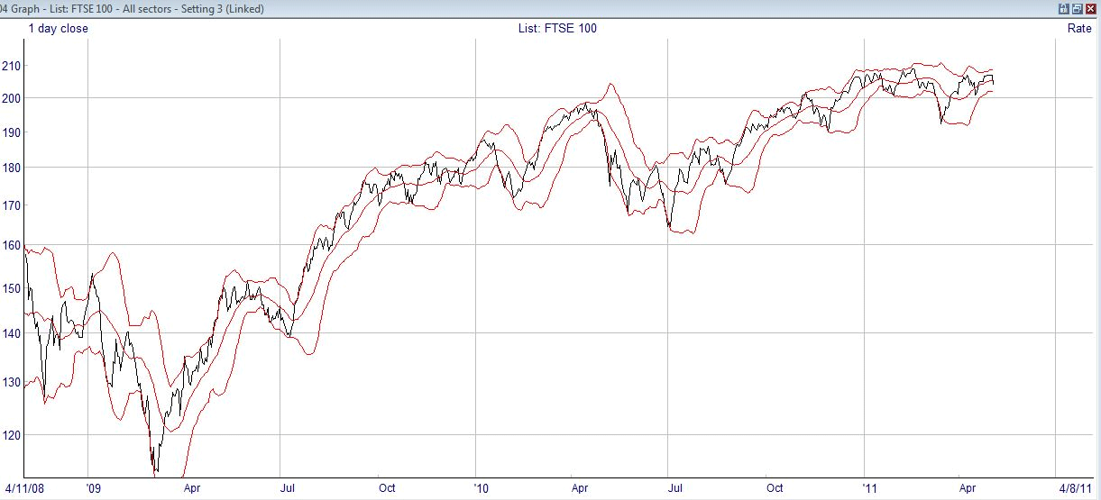
That someone was John Bollinger, and Bollinger Bands are now a widely used tool of technical analysis. If you learned any statistics you may recall the term “standard deviation” which is a measure of how much a number fluctuates. Bollinger uses this figure to describe how wide the channel should be. Because the standard deviation can vary over time, Bollinger bands change in width over time, too. Bollinger bands are placed two times the standard deviation each side of the moving average, and statisticians will tell us that that means that they cover 95% of the expected price movement. Here’s the same chart as above, but with Bollinger bands rather than moving average envelopes: –

“Bollinger Bands answer a question: whether prices are high or low on a relative basis. By definition, price is high at the upper
band and price is low at the lower band. Although Bollinger Bands have been around for more than 25 years, many people still do not understand that.”
First you’ll see that they are much closer to the price that the moving average envelope – well, we could have made the envelope closer by making it only plus and minus 5%, as it is up to us what numbers to use. But the bands do something much more clever than that, as you will see, opening out and closing up in response to the volatility of the price. This gives us a much better idea of when the price is overextended.
What does it all mean? Bollinger bands track price volatility and can be applied to any asset. They often move in wide bands during trend phases, particularly in fastmoving downward markets. As trends weaken, volatility decreases and Bollinger bands narrow. The tightening of Bollinger bands is often a precursor for a big move.
How does it Work? Bollinger bands track price volatility by measuring the standard deviation of price action over a historic period, typically 20 days. This deviation value is doubled and applied to a 20-day simple moving average (SMA) to create two bands, one above and one below the 20-day SMA.
Changes in the deviation multiplier may be required where the historic period is different to 20. In the case of a 10-day Bollinger band the multiplier decreases to 1.9, but this increases to 2.1 where a 50-day Bollinger band is employed.
So what are the signals to look for? For chartists, periods of low volatility marked by the narrowing of price bands can warn of an impending increase in volatility. In the EURUSD chart above there was a pinch and narrowing of the Bollinger bands in early September. This constriction offered a “heads-up” to the late September rally which followed.
As new trends emerge, price action typically runs along upper or lower Bollinger bands depending on the direction of the break. Pullbacks typically stall at the mid-Bollinger band before the original trend resumes. As can be seen in the EURUSD chart, the late September rally was contained by the upper and mid Bollinger band while the November decline was bound by the lower and mid-Bollinger band. Price corrections which move all the way from upper to lower Bollinger band or vice versa can signify a slowing of the trend or the start of a new basing phase with a subsequent drop in volatility.
Bollinger bands can be used to identify M-tops or W-bottoms. In the case of a W-bottom there are two reaction lows. The first reaction low tags (or breaks) the lower Bollinger band before rallying back to the mid-line as is typical in a decline. However, the second reaction low makes a new lower low, but does not tag the lower Bollinger band. Instead, it rallies back to the prior reaction high, forming a neckline. A break of this neckline completes the W-bottom. The reverse is true for an M-top.
M-tops and W-bottoms frequently occur during low volatility periods, so further confirmation occurs when the upper Bollinger band is breached as part of the W-bottom (and vice versa). Divergences in supporting indicators like the MACD or RSI discussed in earlier Chart Wonk articles provide additional assistance when trading these reversals.
Like momentum indicators, periods of strong trending action can keep prices at the upper or lower Bollinger bands for an extended period of time. When price closes outside the opposite Bollinger band, i.e. the lower band for a rally, or upper band in a decline, a warning is given that the prior trend may be about to reverse.
Bollinger bands typically contain up to 90% of all price action, so any move outside of their range is considered significant – whether it’s a confirmation of trend strength or an early warning of a potential reversal, its importance should not be ignored.
Bollinger bands work best when combined with other indicators and were not designed for use as a standalone tool.
When do I make my move? In the case of M-tops or W-bottoms, entry opportunities come on the break of the neckline. Subsequent entries may be taken on return moves to the mid-Bollinger band where the angle of ascent or descent is high.
Bollinger bands work well when used with momentum indicators like the Relative Strength Index (RSI) or Commodity Channel Index (CCI). A move out of an oversold condition for the indicator when price hasn’t violated the lower Bollinger band can be viewed as a buying opportunity. Similarly, a drop out of an overbought condition in a momentum indicator with price honouring the upper Bollinger band is a sell/short signal.
I like Bollinger Bands, it is amazing to see how they work. If you study them, you will see that most of the time in an up-trend the price is contained between the central moving average line and the upper band; in a down-trend, the price tends to stay under the moving average line and run down to the lower band. It’s almost as if they present a boundary to the price when it is trading normally, and the price will run up against them repeatedly, but seldom pass through.
One interpretation of Bollinger bands is that when the price touches or passes through them it is overextended and likely to come back. The price should only be outside the bands for 5% of the time, statistically, so if the statisticians are right it has to come back! But having said that, you can see that in a trending market the price will go up to the band, so you can also regard that line as a price target. In a varying market, such as October 2009 to October 2010 you can see how the price “rattles around” between the two bands providing a limit to its movement. It’s generally agreed that when a price reverses the intermediate price target is the moving average, the central line, but if the price crosses that it has started a new trend.
The study of Bollinger Bands can take up many books, and if you’re interested John Bollinger has his own websites which go into more detail. One further interesting way to look at them is when the band narrows it acts as if it is constraining the price until it can’t be contained any more, and often you will see the price breakout into a new trend after a narrowing of the band width. There’s more on Bollinger Bands in the next section.