The other type of pattern which you should look for is the continuation pattern. Exactly as the name suggests, this is a pattern you will see when the trend is consolidating and continuing. Most of the time, according to Dow’s theories, a trend will keep going in the same direction as it was, so you can expect to see many continuations – but the idea of the continuation pattern is that it is a distinct pattern, different from the price just continuing up or continuing down as we have seen where we drew trend-lines and channels. Whenever the price does something different from just going up or down in waves (which we’ll look at in a later section), then you may be able to find a pattern. After the price does something different, then it will either continue, which as we’ve seen is the most likely case, or it will reverse.
As we’ve said before, there is no such thing as certainty in trading or in making bets on financial markets, so bear that in mind when we look at the patterns. What we are looking for is patterns that on the balance of probability result in, in this case, continuation of a trend. Whenever we see a pattern, it is usual to see if it “resolves” in to the direction we think it is going before placing a bet. Seeing the pattern means that you can be ready to jump as soon as you feel confident.
Triangles
You will quite often see a price fluctuating up and down, where the amount of fluctuation gets less over time, forming a triangle. Here’s an example of one –
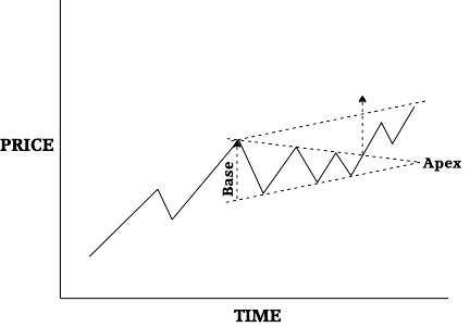
This one happens to be in an up-trend, but could equally well be in a down-trend. The dotted lines show a triangle that you can draw connecting the high points and the low points of the price chart.
You will quite often see is a triangle that has three high points and three low points, just like this one, but that’s not a rule. You can think of it as the price being increasingly contained until it can’t stand the pressure any more, then it is bursting out of the pattern.
Strictly speaking, this is called a “converging triangle” because the price is converging on the apex. This is one you like to see, as it must lead to some action that may be predictable. I’ll talk later about a “diverging triangle”, which is where the price swings more and more as time passes. That’s usually considered to be a scary market and not predictable.
You can have some variations on the converging triangle, and they tend to mean slightly different things. For one, it can occur in an up-trend or down-trend, and it can be pointing up or down, or just straight across like this one, which they call a symmetrical triangle. You can even have triangles where the top or bottom line is horizontal, like a resistance or a support line, and that’s a special case.
The symmetrical triangle, as shown above, is kind of neutral in its effect. It’s really just a pausing place for the trend before it continues. It’s most likely the trend will carry on, and this triangle shows no bias in either direction.
On the other hand, if you have what is called an ascending triangle in an up-trend it’s most definitely bullish, indicating that the up-trend will continue. Here’s a picture of that –

With what you have learned so far you can probably work out why this is bullish. The top line of the triangle is horizontal and is a resistance line. This means that it tends to stop the price rising any higher. But as we mentioned in the last section, at some stage the resistance is usually broken and the price “breaks out” to higher levels. The lower line of the triangle, connecting the low points, is still showing an up-trend. So everything points to the price continuing upwards once it has overcome the resistance.
Just a word about the arrows on those charts. These are used to give you a price target. The first arrow, where the pattern starts, gives you a measurement of price. The second arrow, from where the price breaks through the triangle, is simply drawn the same length and gives you a target distance that the price should meet or exceed once it has broken out. When you look at a potential target, it’s not because you’re going to exit your bet when the price gets there – if it is still going up you want to take advantage of any more gains – but it is used just to work out whether the bet’s worth taking in the first place, compared to the possible downside. The downside is how far you’re going to let the price go in the wrong direction before you close your bet, and accept that it failed. We’ll talk about that in a later section
Because the ascending triangle is so powerful, it can even be a bullish signal in a down-trend. In this case it would be a reversal pattern. It is a good idea to look for more confirmation of the strength of the up-trend by looking at the volume of trading, just as we did before. If you hope and expect that the price will continue upwards then you will want the volume to increase when the price is going up, and be light when it is falling. It is a simple concept when expressed like that, but you would be surprised how often volume indications are ignored or forgotten, only to find that looking at them would have saved taking a losing trade.
The companion to the ascending triangle is the descending triangle, and as you would expect it mirrors everything about it. In other words, you will usually see it in a down-trend, but whether you do or not it still counts as bearish. The horizontal line forming the bottom of the triangle is the support, and the price tests this several times before it breaks down and continues its descent. You know that the continuation has recommenced when the price closes below the support level, and you can also look to the volume of trading for some assurance of the strength of the move.
What about the triangle pattern that is sloping even more than these ascending and descending triangles? For instance, you may see a triangle which points downward, and surprisingly it’s most commonly seen in an up-trend. They call this a wedge formation. Here’s a downward wedge in an up-trend –
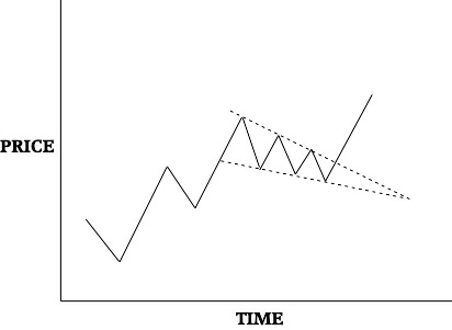
Once again, you need to look for signs of which way the market is going. While this is shown as a continuation pattern, you might see it in a down trend where it is likely it would be suggesting a reversal, as it will usually tend to be a bullish sign wherever it is found. In a down-trend it you would be most likely to see a rising wedge formation, but wherever it is seen the rising pattern is usually taken as bearish.
One last important point about these triangles. These patterns take several weeks or months to resolve, usually with a continuation of the trend. If you’re looking at a much shorter time-frame and see this pattern then it may be a “pennant”, which I’ll describe in a moment.
Now the diverging triangle is a totally different animal. It’s sometimes also called the megaphone top or the broadening formation, and this just describes what it does – as the chart goes to the right over time, the ups and downs of the price get further and further apart, the opposite of the converging triangle we’ve just been looking at. If you try and think what it might mean, you will see that it shows a lot of unsettled trading in the market. Neither the bulls nor the bears are dominating the price, but with each swing they are apparently trying harder.

What can you do when you see this? Generally, just leave it alone. If you guess wrong (and there’s no way to tell which way the pattern will break out) the widening swings will guarantee that you lose heavily. It’s better to concentrate on high probability trades, unless you are the type who wants to go to Las Vegas. That said, when you do see this formation it’s usually in an up-trend, for the simple reason that up-trends tend to have more activity than down-trends and this is a very active pattern, and it’s quite often followed by a down-trend, as shown.
Pennant Pattern
At first sight, the pennant pattern that may look very similar to a triangle but there are some important differences. As mentioned above, the pennant pattern does not take long to resolve, and will usually only be a couple of weeks. It tends to come after a big move, either up or down, and you can think of it as the market taking a breath before the trend continues. It is usually symmetrical, which means that the triangle does not point up or down.
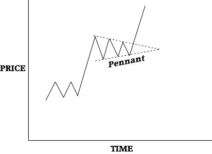
Some people will say that the pennant occurs halfway through a price movement, which means you should expect the continuation to be as long as the first part of the trend. Again you can look at the volume of trading to help confirm the meaning of the pattern, but you won’t find as much increase with the trend. It’s more like the move is expected, particularly after the large move before the pennant, so you don’t have the build-up of pressure within the pattern. Having said that, you will see volume increase on the breakout.
Parallel Patterns
Now we have dealt with triangles, which are mainly converging patterns but can sometimes be diverging, the obvious next shape to look at is the parallel pattern. This is where the price fluctuates between two lines which are parallel to each other, just like the trendline and the channel line which we covered in an earlier section. In that context we were looking at them continuing, providing support and resistance to the price moves – and in the simplest of these patterns, the lines are horizontal, with definite fixed price levels for the support and resistance.
This particular pattern has been extensively written about, having been used by Nicolas Darvas who was actually a dancer to make $2 million in the middle of the twentieth century, which sum is probably worth at least $20 million nowadays. He published a book about it in 1960, and coined the name “box trading”.
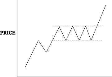
A simple search on Darvas’s name on the Internet will get you a whole lot more details about box charts. The basic theory is that some charts will advance in a series of steps, and when the price breaks out of the “box” or parallel lines then you can expect it to increase at least as far again. The difference from a triangular shape is, obviously, that there is no particular time limit for when it must breakout. The pattern can continue indefinitely, and is usually from 1 to 3 months. The breakout is confirmed when trading closes outside the lines.
One of the chief problems with box trading is that you sometimes have to wait for a long time to find the pattern. There is no compulsion for the price to oscillate between support and resistance like this, and if there is a trend it will tend to follow that rather than wait. But stocks can spend a reasonable amount of time in “sideways” movement, so this sort of pattern can occur.
Usually you will see this as a continuation pattern, but you would again look to the volume of trading to see which way the market is moving. You obviously want to see heavy volume in the direction of the trend, and lighter volume retracing, until the price breaks out of the channel. If you had the opposite volume indications, then as you can see this pattern could easily be a triple top reversal.
There are a couple of ways that a trader will play this pattern. Some will take short-term positions within the channel, buying at the bottom and selling at the top and expecting the pattern to continue for a time. The risk is quite small, because if the price doesn’t reverse and instead breaks out of the channel you will know very quickly and be able to minimize your loss.
Others will wait for a definite breakout, and from there expect the price to go up at least as far as the size of the channel. If you recall the lessons in support and resistance, you will see that the resistance line becomes a support after it is broken, stopping the price going back into the channel, so even if you do not take your profit when you should and the price comes back down, this should protect you from losing too much.
You will also see a parallel pattern at an angle, and this is called the “flag” because it looks like one. This is a short term pattern only lasting a couple of weeks on average and the meaning is rather like the pennant – it’s just a pause in a trend after some rapid progress. Just like the wedge, it usually slopes in the opposite direction to the trend. Here’s a bullish flag in an uptrend –
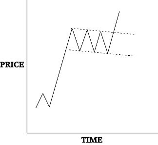
The flag is considered a fairly reliable continuation pattern, and is not likely to herald a reversal. There is a strong trend before it, and it just allows everyone to “catch up” mentally before continuing the trend. It can occur in both up-trends and down-trends, and almost invariably slopes against the trend.
Head and Shoulders
I left this to last when looking at the continuation patterns so that you could take all those in before getting confused! Yes, the head and shoulders pattern can appear as a continuation rather than a reversal which is its well-known role.
Actually, you shouldn’t get confused because the head and shoulders pattern is followed by exactly the same trend as in its reversal role – it just appears in the “wrong” trend. So, instead of the head and shoulders appearing in an up-trend it occurs in a down-trend; and the inverse head and shoulders appears in an up-trend. It happens much less in these positions, too.
Just to be clear then, the head and shoulders with the head and the shoulders being made up of price peaks is likely to be followed by a down-trend. As a reversal signal it appears in an up-trend, as a continuation signal it appears in a down-trend. So you can still consider it as a bearish signal.
The inverse head and shoulders, which has the head and shoulders pointing down, that is made up of low points, is similarly always a bullish pattern. As a reversal it appears in a down-trend, and as a continuation pattern it happens in an up-trend, and the result is usually an up-trend.
So that you can see that all the different patterns are not particularly special or unusual – they are just interpretations of the mood of the market, and are a shorthand way for you to readily see what is happening when you glance at a chart.