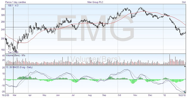
As this is a more complex oscillator at first sight, I’ve kept the discussion of it until after the basic oscillators. The name, Moving Average Convergence/Divergence, is usually shortened to MACD, which can be pronounced mac-dee. This was invented by Gerald Appel, and it combines the function of an oscillator with a crossover system to give trading signals. As suggested by the name, it is based on moving averages, which we discussed in the last chapter. Here is the same chart with the MACD on the bottom:

This is the full version of the MACD, which includes the little histogram bars in green. Looking first at the lines, the solid line plots the difference between two exponential moving averages, in this example the EMA(13) and the EMA(26). As we saw previously, the crossing of two moving averages can be taken as a signal to buy or sell, although it tends to lag a little behind the price action. As the solid line plots the difference between two moving averages, when it crosses the zero line the averages are the same, which would be a crossing point on the price chart. You could do the same thing by plotting the moving averages and seeing where they cross.
So the solid line is a plot of the convergence and divergence of these two moving averages, hence the name. But to take it one stage further, Appel decided to see how much the convergence and divergence was varying by plotting a moving average of the MACD line. This is represented by the dashed line, which is a nine day exponential moving average, EMA(9), of the MACD line (not the price line). If you use this line as a signal line, it anticipates the MACD line crossing zero, and gives an earlier signal without the lag of the double crossover method.
So one use of the MACD indicator is to go long when the MACD line crosses above the signal line, and to take a short position when the MACD line crosses below. Just by looking at the chart, you can see that this would generally put you on the right side of the trade.
But as the MACD line goes above and below zero, it is also an oscillator that indicates overbought and oversold conditions. There is not a set extreme level, but when it is high it indicates overbought, and when it is low it shows the market is oversold. So the best buy signals occur when the lines are well below zero, and the best sell signals when the lines cross high on the chart.
Some examples of clear trades indicated by the MACD on this chart are taking a long position in March, a short position in the middle of April and the end of June, a short position in the middle of October and possibly November, and a long position at the right-hand edge, in February 2010. With the exception of the short trade in April which does not last very long, you can see that the MACD would have given good results overall.
As for the green histogram bars, these plot the difference between the two MACD lines. When the histogram crosses zero, it shows the MACD lines are crossing, which is the trading signal. That is just duplicating information, but the value of the histograms is in noting that when the bars start reducing in length it shows that the MACD lines are getting closer to crossing. It gives you early warning so that you can prepare to trade.