The moving average is one of the most widely used indicators in the field of technical analysis. It has been around since the inception of analysis, unlike many of the technical indicators that we will look at next. The moving average is actually a family of moving average lines. You can choose different numbers of days, or time periods, and there are also different types of moving average, which have been invented to try and reduce perceived shortcomings. A moving average indicator is particularly useful to help you identify and trade an established trend.
The basic type of moving average is called a Simple Moving Average (SMA). I think everyone knows what an average is – you simply add together a certain number of numbers, and divide the total by the number of numbers. This is known as the arithmetical or simple average of those numbers. The Simple Moving Average in technical analysis is drawn as a line on the chart by averaging price action of a recent period. For any given day, you simply add together the prices for the past certain number of days, divide by the number of days, and plot the point. The line joins all the points. Here you are simply plotting the average price of the market over a specified number of preceding days.
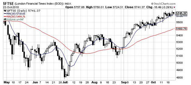
Moving averages are simple but effective and can help you determine the trend of a market, as well as to time entry and exit points, among other things. The Simple Moving Average is usually written as SMA(x), where x is the number of days, or other time periods. Here’s the FTSE chart with the SMA(10) and SMA(50) added:

The SMA (10) follows the prices fairly closely, and as you would expect the SMA (50) is further out. The more periods you use, the smooth and straighter the line.
Because the moving average smooths out the price chart, it will show you the direction of the overall trend, up or down. It is called a “lagging” indicator, because it uses historic information, its value always follows the market action and cannot anticipate it. The moving average can be used in many different ways, and because it’s so easy to construct it forms the basis of many trading systems. You can see on the chart above that the short term moving average acts like a curved trendline, providing support in uptrends and resistance in downtrends. In this example, it is not exact and is sometimes broken, but if you adjusted the number of days used for the average you would be able to come quite close.
I mentioned that there are different types of moving average, and these have been developed to try and make the average line more relevant to the current price. They tend to place more “weight” or significance on the most recent price figures to try and reduce the lag. The second most popular type of moving average is called the Exponential Moving Average (EMA), and there are several other types that you may find on your charting software.
All moving averages fluctuate less than the prices. The greater the number of days that you average, the smoother the line becomes and the less related to the current price activity. Therefore when you use a moving average in your trading plan, you can experiment with different numbers of days to see what works best.
One simple strategy is to buy when the price closes above its moving average and to sell when it closes back below it. A simple way to use a moving average to indicate that the direction of a price is changing is to look for a crossing, where the price crosses the moving average line. If you include too few days in the average, then you may find you have too many signals, as in the SMA (10) in the chart above. The short-term average will give earlier signals at the expense of making more trades. However the SMA (50) may be too slow to act. The optimum length of moving average is related to the length of the trends. If the financial security exhibits long trends, then a long-term average will work best; but if there is a trend reversal, the short-term average will be better.
Another way to trade with moving averages is to use two moving averages to give trading signals. This is called a double crossover method. You can choose many different combinations of time period, such as the SMA(5) and SMA(20), SMA(10) and SMA(50), etc. The trading signal is when the average lines cross each other. Again it’s worth experimenting with different numbers to see what works best for the security you want to trade. The double crossover method lags a little behind the single crossing, but is less likely to give false signals.
When a price is trending, moving average techniques are usually very effective. If the price is going sideways, then plotting an average won’t really mean much, and is not much help to predict future movement. In the next chapter we look at technical indicators which are much more effective in this situation.
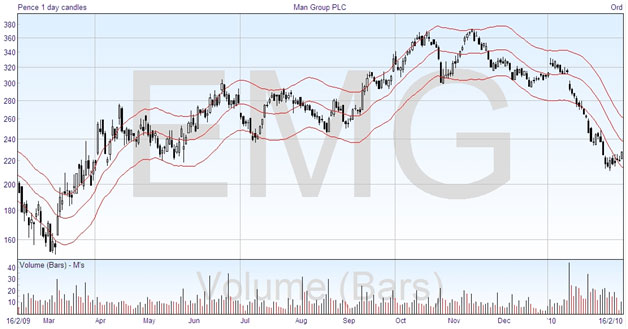
To see when a price is overextended in either direction, you can use a moving average envelope. The idea of this is the same as with the trendline and channel line, but there is no problem trying to fit a straight line to the chart. The envelope is simply a line drawn each side of the moving average, at a set distance away, giving upper and lower boundaries that you don’t expect the price to penetrate. Here is an example:

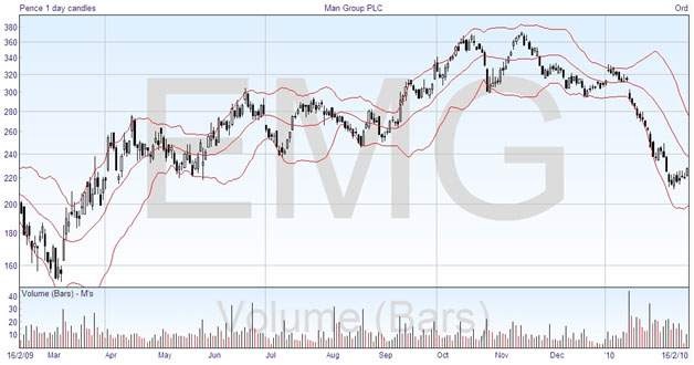
The middle line is an SMA (20), and the envelope lines are positioned 10% away. These are common figures used in this technique. A development from this was created by John Bollinger, and Bollinger bands are similar but improved. Here is the same chart with Bollinger bands rather than the moving average envelope:

As you can see, the difference is that the envelope lines vary in their distance from the moving average. Sometimes they are wide apart, and at other times they get narrower. Just from looking at these two charts together, you can see that the Bollinger bands do a much better job of defining the boundaries that the price will go to. The width apart is based on the “standard deviation”, which is a measure of the price volatility, and statisticians could tell you that 95% of the prices will be within these bounds.
One of the simplest uses of Bollinger bands is to use them as price targets. In an uptrend, as you can see, the price will tend to touch the upper band, and will stay within the upper half of the bands. When there is a downtrend, the price tends to push down on the lower band and stay in the lower half. When the price crosses the middle line, which after all is only a moving average, it indicates that the trend may be changing.
Another way in which you can look at the Bollinger bands is to observe the width between them. If it narrows right down, “squeezing” the range of the price, this is often followed by the price breaking out and starting on a new trend. When the bands get far apart, this shows a slowing of the current trend.